Handicapped or Accessible?
Modernizing a medieval concept of ‘disabled’ symbol

The handicapped symbol is so commonplace it goes unnoticed… until we’re eyeing those desirable spots in a full parking lot. As a pictogram nerd, I not only noticed it, I thought it was worthwhile challenging the medieval concept of a ‘disabled’ person as a beggar.
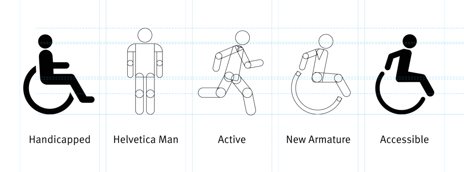
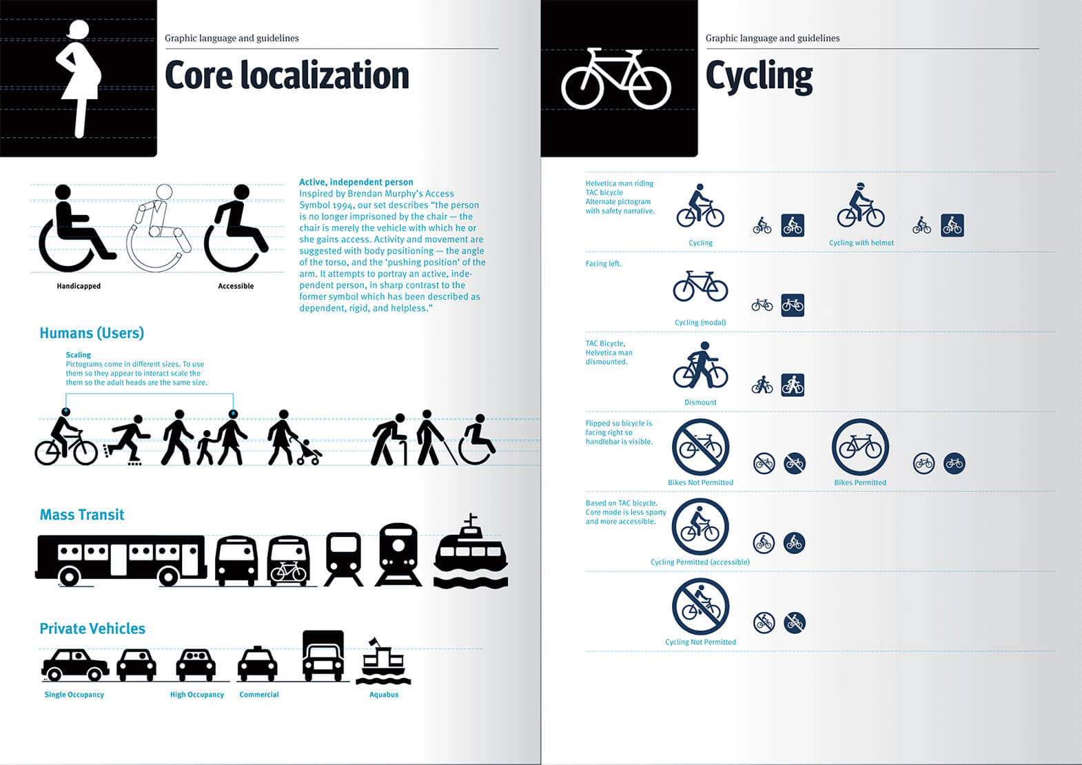
Although the word itself is considered acceptable, the etymology of the v. handicapped originates from a 17th century phrase meaning hand in cap. This archaic concept was particularly inappropriate when I was working on visual standards for Metro Vancouver’s transportation authority. Accessibility is one of the defining attributes of the TransLink brand. Inspired by Brendan Murphy’s 1994 Access Symbol, I created a unique version using my Helvetica Man(1) armature. In the updated narrative, “the person is no longer imprisoned by the chair — the chair is merely the vehicle with which he or she gains access. Activity and movement are suggested with body positioning — the angle of the torso, and the ‘pushing position’ of the arm. It attempts to portray an active, independent person, in sharp contrast to the former symbol which has been described as dependent, rigid, and helpless.”
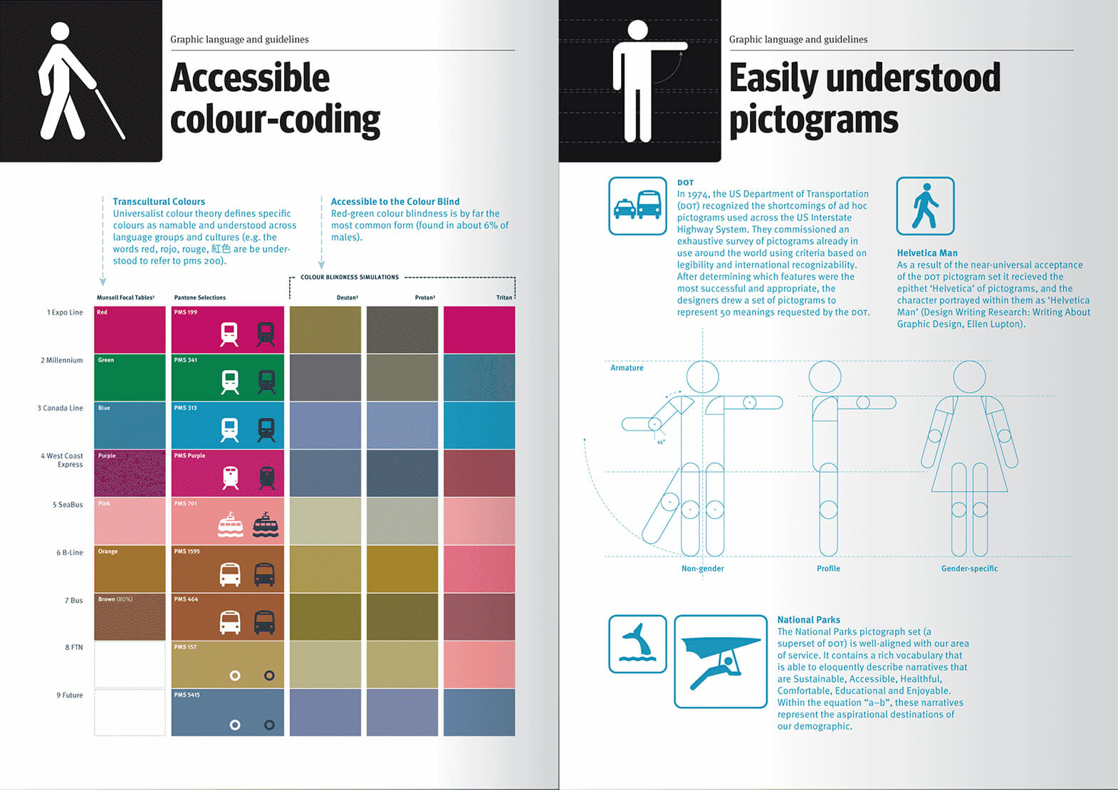
(1) A moniker coined by Ellen Lupton referring to a human figure from the 1974 set of pictograms created for the U.S. Department of Transportation (DOT). This pictogram set and the figure illustrating it is so universally recognized, subliminally understood, and expressly understated that any type designer immediately recognizes the merits in its namesake.
Thoughts on Design | Oct 24, 2016
By Andrew McKinley, Associate Art Director at DCD


